Fringe World Festival 2019
Industry
Arts + Entertainment
Services
Branding: Visual Identity / Print
Industry / Services
The Fringe World Festival 2019 Brief
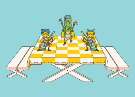
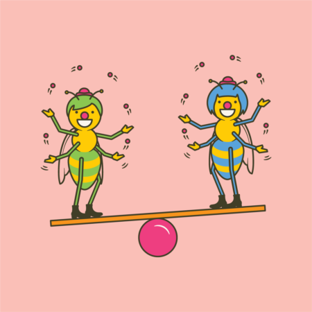
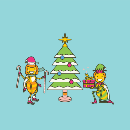
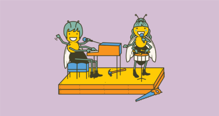
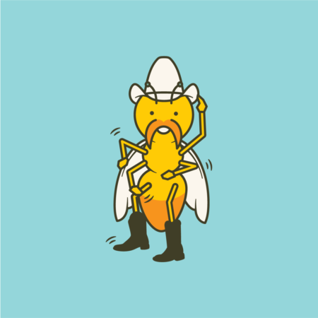
Fun, summer, excitement, a little bit cheeky and distinctly Fringe. Knowing that we wanted a WA mascot, we began thinking about local favourites Green Burrowing Bee or Megamouth Bee, Native flora with strong bold colours, maybe some quokkas selfies too, for good measure.
With our 6th season of developing the Fringe World Festival branding, we took the opportunity to look upon the previous seasons and think on what had worked best over the years. Exploring the approach of a 'responsive illustration' like we'd developed in our 2017 season campaign.
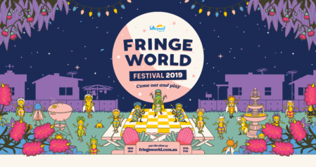
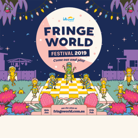
Taking key elements from previous years, we built out an illustrated scene with special consideration to foreground, mid ground, background. From there, we also created key edge framing elements, so the illustration could respond to the changing dimensions of any given touchpoint — much like a responsive website does!
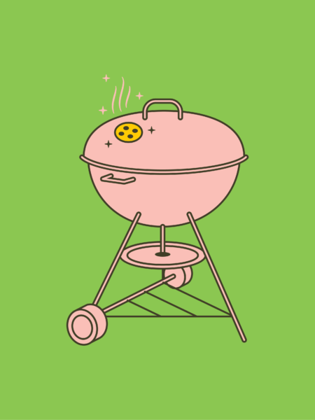
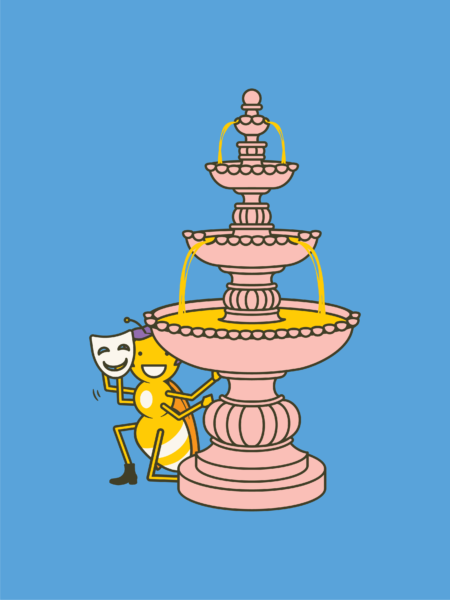
We built out a cast of ideas, characters and objects to populate the scene but also with the flexibility to be used independently for any number of marketing activities by internal staff or external partners & promoters.
Scope of Work
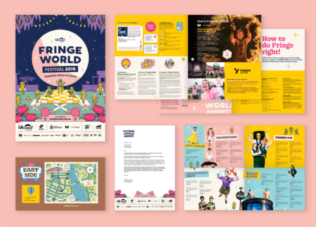
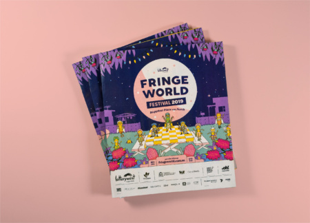
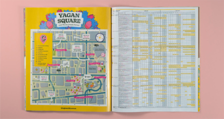
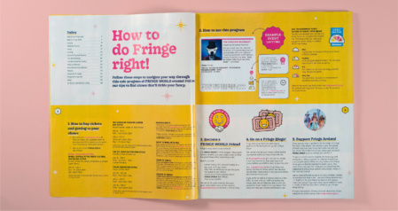
152 Page Print Publication, Festival Branding, Responsive Campaign Illustration, Letterhead, Posters, Billboards, and Print + Digital Advertisement.
View more Fringe World Festival case studies:
THE SOLUTION
A 1960s garden party with lots of native flora, set in the backdrop of an Australian backyard. A party that’s equal parts outdoor garden and discotheque.
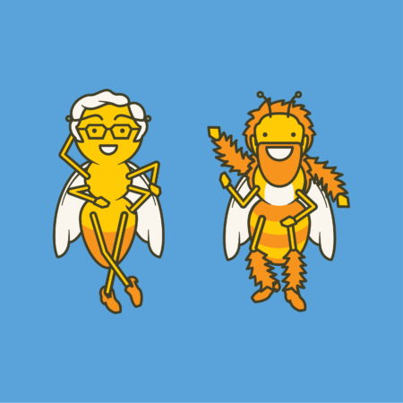
We further developed the rationale around celebrating bees as an example of matriarchal societies, strong communities, industrious ‘invisible’ workers and critical symbols of a healthy environment.
The matriarch herself was a queen Dawson burrowing bee as a kind of Carmen Miranda meets British Queen meets god-like-Ganesh, but with a beehive hairdo of course.
