Alby
Industry
Hospitality
Services
Brand Strategy / Branding: Visual Identity / Packaging / Print
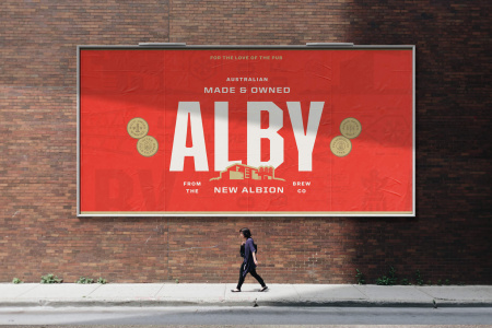
Alby was launched in 2017 as a stadium lager for Western Australia, and whilst it achieved moderate success locally, it struggled to resonate nationally. Because of that, it didn't just need a fresh coat of paint, it needed a tangible reason for being. With that in mind, we were asked to completely rebrand Alby in 2024.
One of the core challenges was to work out how to rebrand a fairly new brand, and make it look right at home on a tap bank with the classic beer brands that have been around for 150 years of more. Inspired by the very first 1837 Albion Brewery, we set about to make a "new classic", rooted in pub culture: mateship, simple pleasures and pride in being Australian.
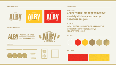
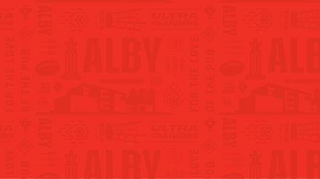
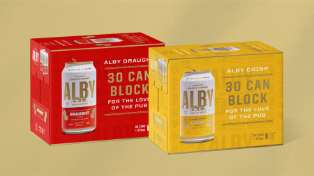
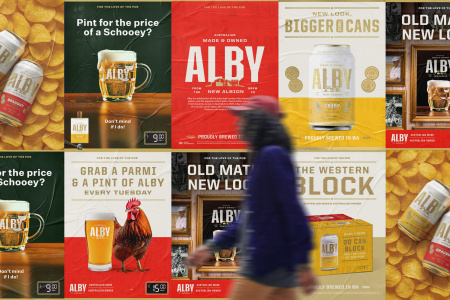
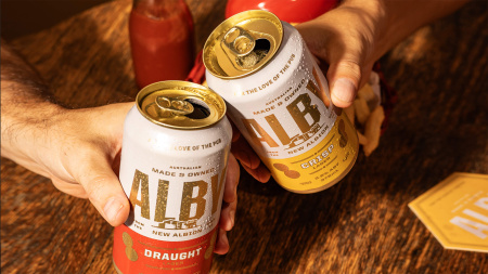
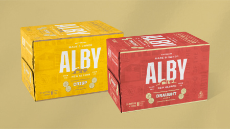
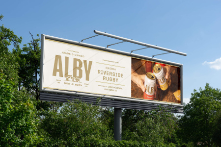
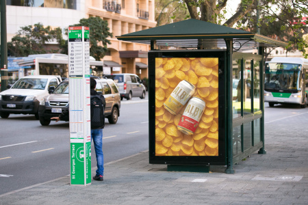
This strategy guided everything from positioning and messaging to the pattern design and POS rollout. We designed cans, bottles, six‑packs, 30‑can blocks, carry packs and more, across both Crisp and Draught SKUs.
Post-rebrand, Alby achieved ~21% year-on-year growth in packaged formats and ~57% growth in keg, indicating a significant change in brand performance across multiple channels.
Creative Team
Branding, Visual Direction, Packaging, Design: Studio Papa
Building Illustration: Dwight O'Neil
POS Roll Out: Marcus Taylor, Sophie Osborn, Garreth Bennett, Nathanael Whale
Photography: Chris Rowson, Studio by Pixi Lane, Laurie Perry
Press
Featured on Dieline