BrewBuds Club
Industry
Consumer Brands / Hospitality
Services
Brand Strategy / Branding: Verbal Identity / Branding: Visual Identity / Packaging / Print / Style Guide
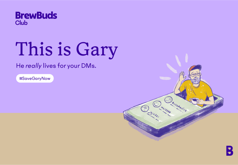
Gary Sawyer has been running an online coffee community in one form or another since 2011. After years of selling coffee for other companies — and later under his own brand, Coffee Fusion — he was ready to take things to the next level and launch a national coffee subscription service.
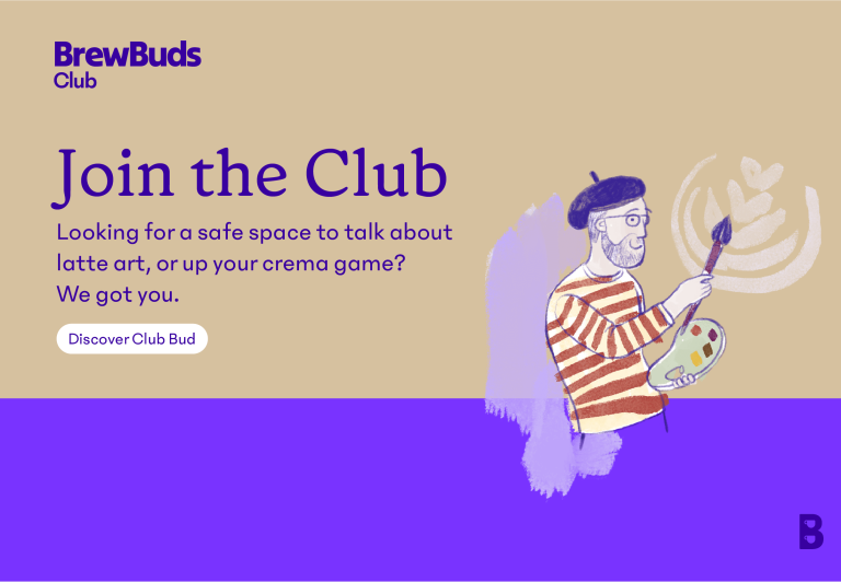
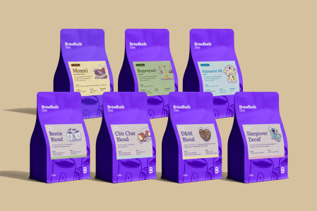
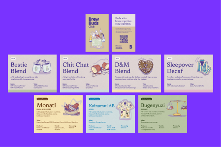
Gary’s vision was to build a membership-based club where people could make better coffee at home (on the machine they already owned), learn from a supportive online community, and receive freshly roasted beans via subscription. To do this, he needed a completely new visual identity — one that felt credible enough to compete with national subscription services, while still personal enough to reflect his direct, one-to-one engagement with every customer.
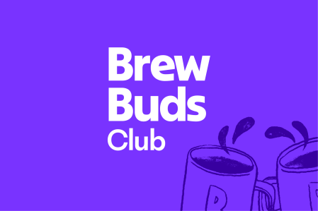
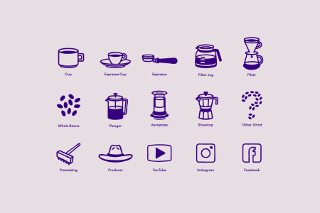
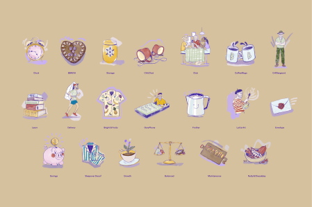
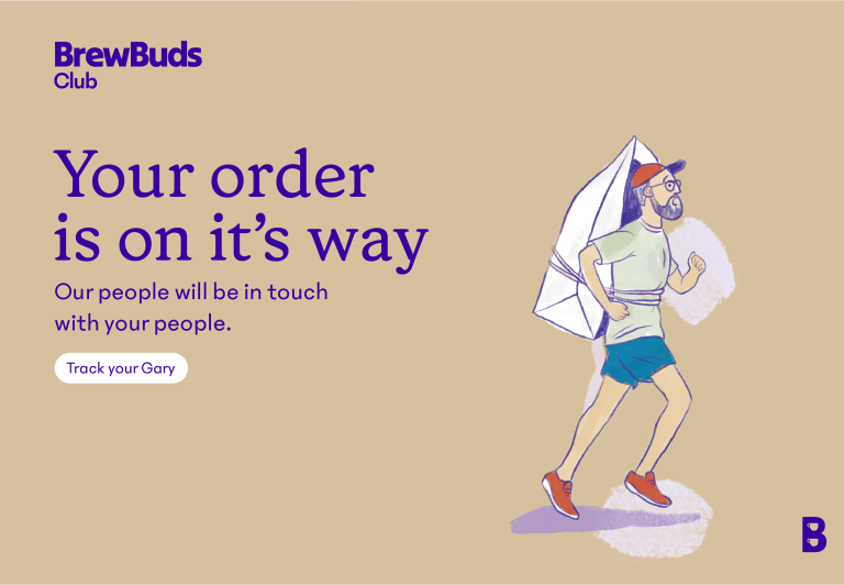
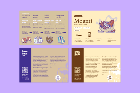
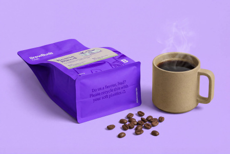
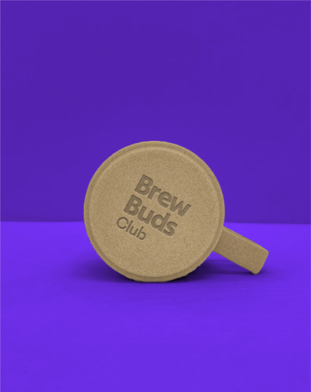
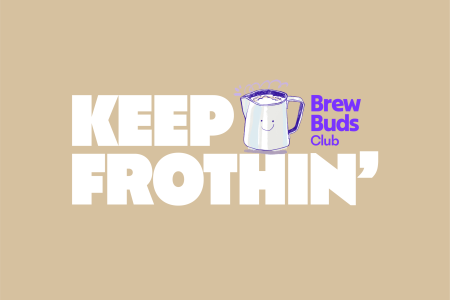
Studio Papa began by defining the brand’s brand’s purpose and positioning, laying the foundation for everything that followed. From there, we developed the name BrewBuds Club — something deliberately bigger, more contemporary, and more social than Coffee Fusion. We then built out a complete brand system, including a digital-first colour palette, an extensive icon library, and over 20 custom illustrations with our good mate Natasha Muhl. Coffee bag packaging and print marketing materials were designed to showcase the new identity and establish a distinctive colour presence within a crowded market.