Hoochery Distillery — Canned Cocktails
Industry
Hospitality
Services
Branding: Visual Identity / Packaging / Print
When long-time client Hoochery Distillery approached us with a new product line — ready-to-drink canned cocktails — we saw an opportunity to utilise some long lost inspiration material we'd been sitting on since the beginning of the relationship. The brief called for packaging design and branding that felt at home alongside Hoochery’s existing portfolio, aligned with the RTD Premix market, and stood out on crowded retail shelves.
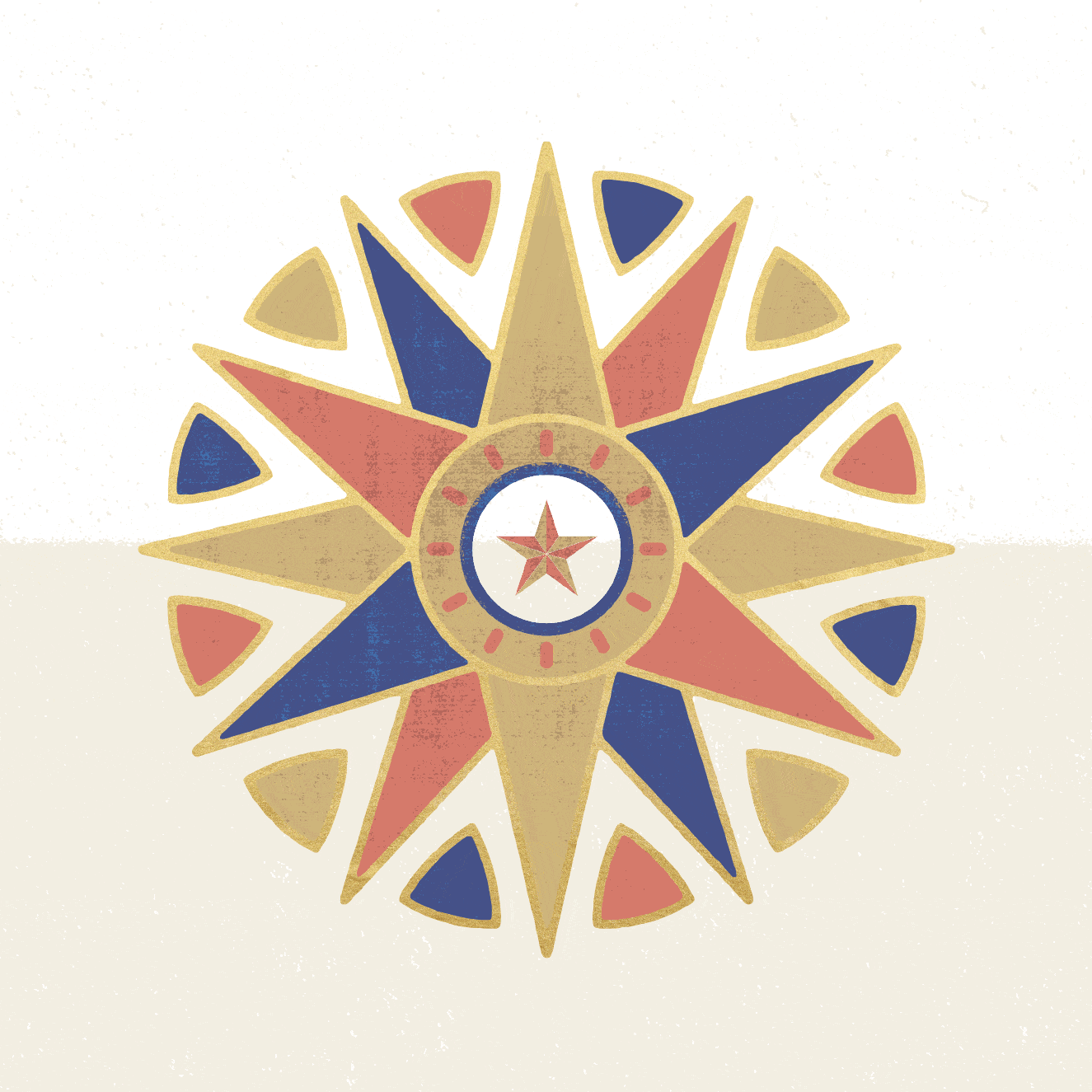
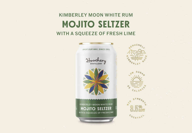
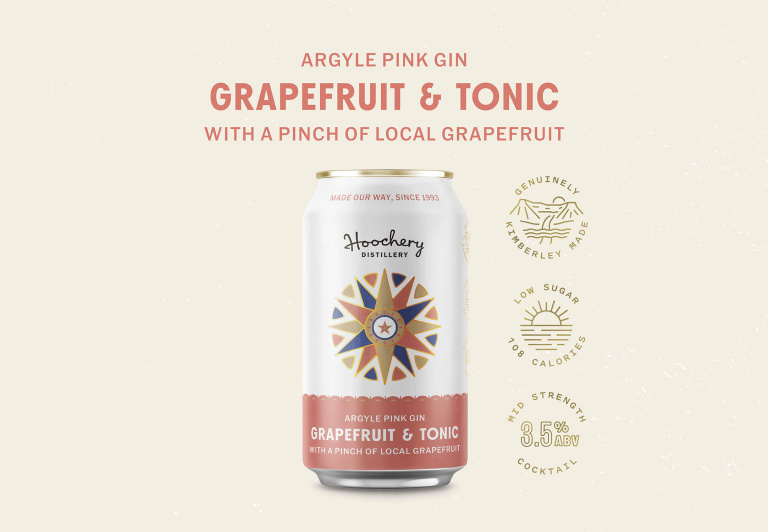
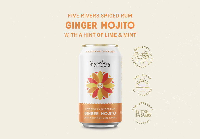
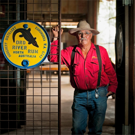
During our first site visit to the distillery, we noticed a series of hand-painted hex signs on old oil barrel lids, displayed around the farm. Founder Spike created these colourful symbols as good-luck charms, inspired by the Pennsylvania Dutch tradition of painting hex signs on barns. We were drawn to their folk-art simplicity and deep connection to agriculture and craft — values that sit at the heart of Hoochery. Those motifs became the anchor for the canned cocktails packaging design.
We developed a suite of custom hex signs for each flavour, combining geometric forms and floral motifs into a consistent visual language. These icons were paired with a warm, earthy colour palette and clean typography to balance heritage and modernity across the Hoochery canned cocktails range.
Photography by Landi Bradshaw Photography