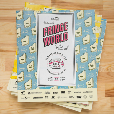
Fringe World Festival 2015
Industry
Arts + Entertainment / Not For Profit
Services
Branding: Visual Identity
Industry / Services
The Fringe World Festival 2015 Brief
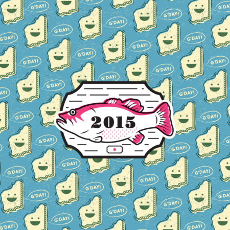
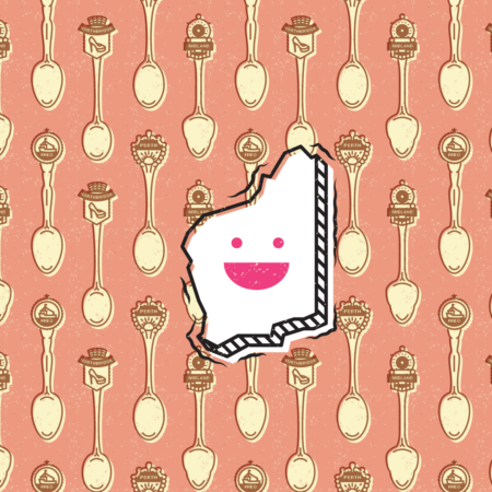
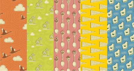
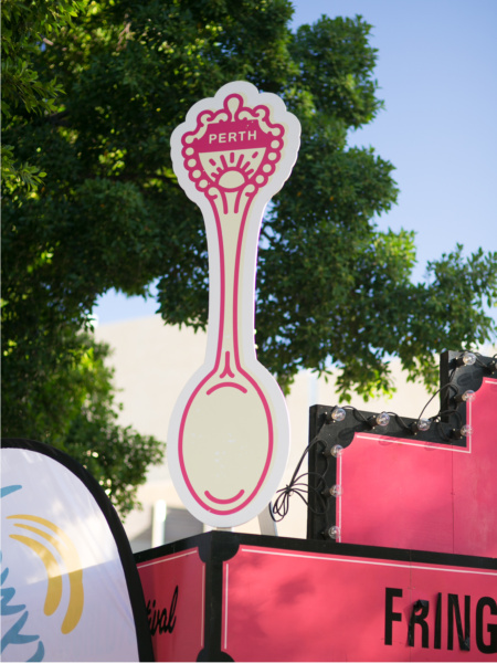
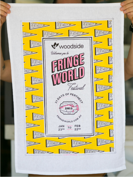
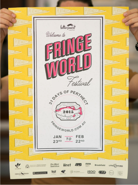
Fringe World as a 'holiday destination', kitschy WA/Australiana travel guides & tea towels, vintage American tourism, summer, fantasy/nostalgia, cheeky, accessible, 'safe' exoticism, and neon signs where possible.
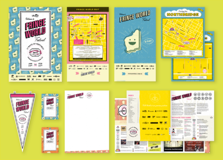
After the massive success of the 2014 season campaign, we wanted to up the stakes for the Fringe World Festival 2015 brand identity. Continuing the winning formula of illustrated patterns, we pushed our computers and our imaginations to the limits with multilayered designs, dynamic pattern layouts, and packed with even more colours + textures than the previous year. Whilst keeping a vector based workflow for maximum flexibility of application, we used every trick in the book to make the artwork design as interesting and exciting as we could. Our computer processors still haven't recovered!
Scope of Work
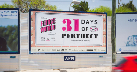
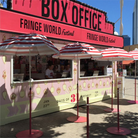
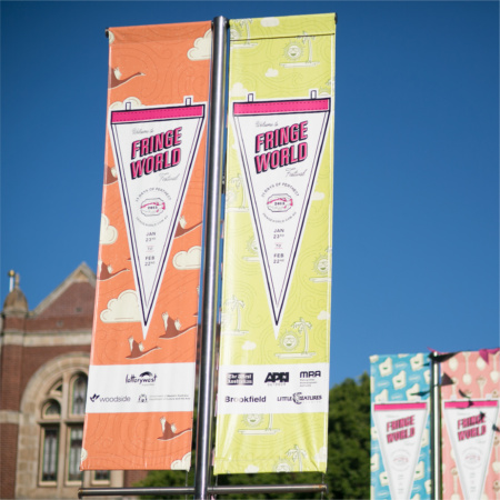
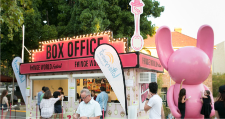
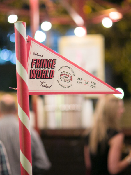
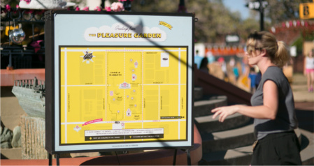
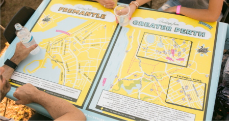
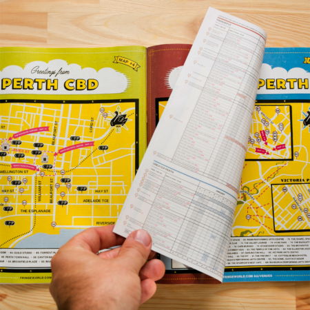
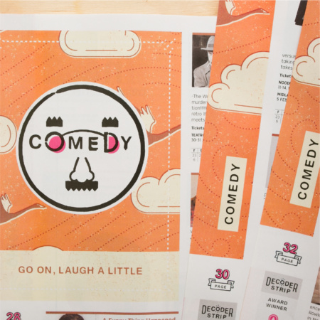
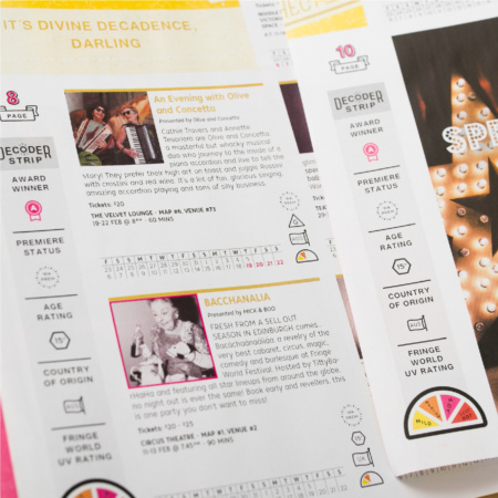
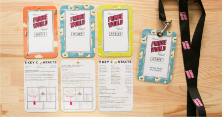
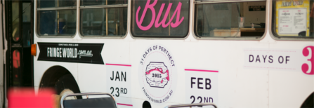
113 Page Print Publication, Festival Branding, Fringe World Corp. Branding, Outer Fringe Branding, Lightbox + Print Maps, Print Advertisement, Billboards, Pennants, Bus Wraps, iiNet Rickshaw Wrap, A Frames, Tea Towels, Lanyard Passes, Aprons, and Tablecloths.
View more Fringe World Festival case studies:
FW 2014 Case Study
FW 2015 Case Study
FW 2016 Case Study
FW 2017 Case Study
FW 2018 Case Study
FW 2019 Case Study
THE SOLUTION
The concept for Fringe World Festival 2015 was conceived with its new-found international reputation in mind. With Fringe growing at an exponential rate, overseas artists were now beginning to target Fringe World as an essential festival in the touring circuit. This made us think about lowbrow tourism souvenir culture, and, more specifically, Perth’s quintessential brand of lowbrow tourism souvenir culture – the tacky trinkets and ornaments we once thought daggy, but now enshrine our office walls.