Fringe World Festival 2018
Industry
Arts + Entertainment / Not For Profit
Services
Brand Strategy / Branding: Visual Identity / Print / Style Guide
Industry / Services
The Fringe World Festival 2018 Brief:
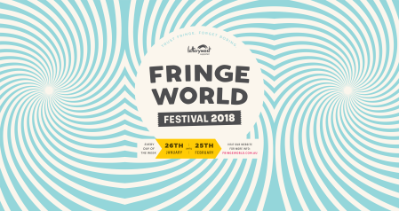
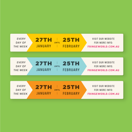
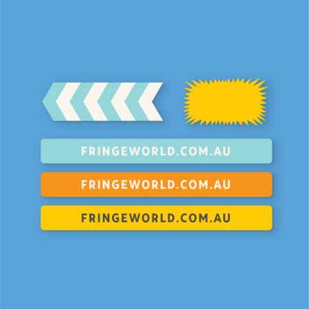
Exciting, fun, bright, loud, strong, not too clever or designery, not subtle or on trend, washing powder aesthetics, timeless but not nostalgic and a really big legible logo.
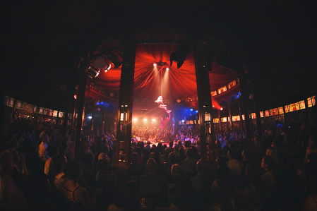
By the 5th season of working on Fringe World, the festival had already achieved significant growth and was now a truly established name. Change was in the wind, and to match this we needed to progress the brand into a bigger feel and a fresh aesthetic direction that was fitting of its market position.
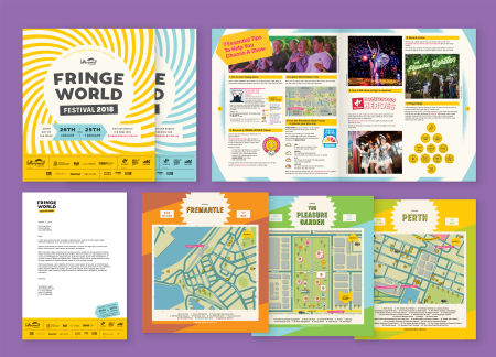
Scope of Work
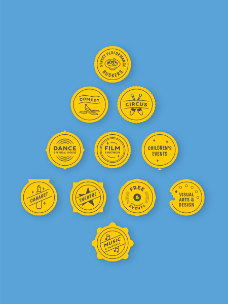
144 Page Print Publication, Festival Branding, Genre Icons, Print Ads, Award Icon, Billboards, Letterhead, and Billboards.
View more Fringe World Festival case studies:
FW 2014 Case Study
FW 2015 Case Study
FW 2016 Case Study
FW 2017 Case Study
FW 2018 Case Study
FW 2019 Case Study
THE SOLUTION
We made the brand bolder, bigger and little less fussy. Changing the focus from detailed scenery, patterns or motifs, we focused on the simple, fun impact of vintage washing powders without getting too literal as to the inspiration origin.