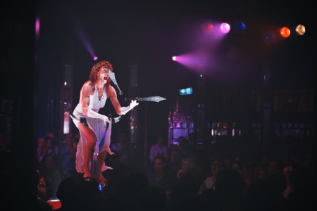
Fringe World Festival 2016
Industry
Arts + Entertainment / Not For Profit
Services
Branding: Visual Identity
The Fringe World Festival 2016 Brief
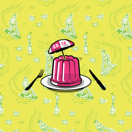
'Merry Fringemas', school & summer holidays, keeping the post-Xmas good vibes going, 'treating yo-self', Cornetto's, something for all class groups and refreshing, just like a cold beer after a hard days work.
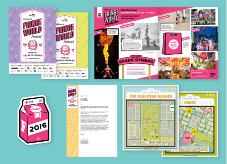
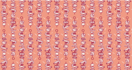
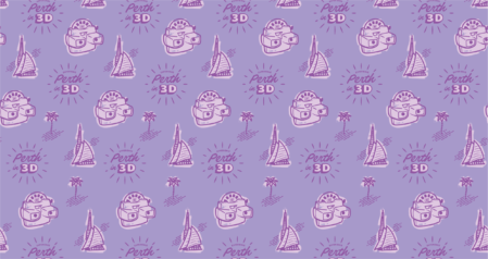
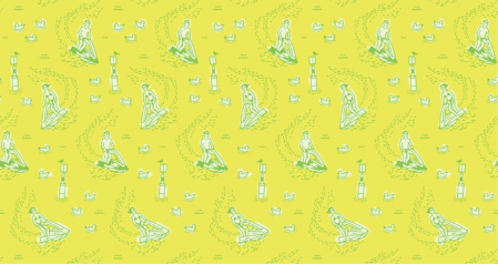
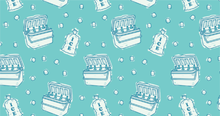
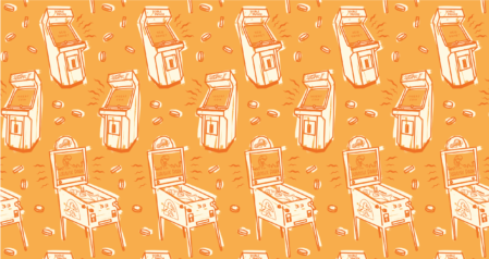
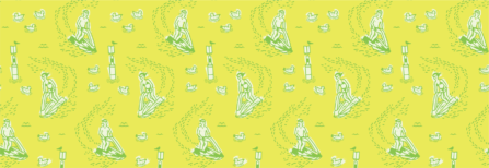
For our 4th season of working on the festival identity, we continued the winning formula of the 2014 campaign and 2015 campaign and set to work developing a core icon as a mascot to embody the spirit of the Fringe World Festival 2016 brand. In addition we developed a suite of illustrated tiling vector patterns for maximum flexibility and scaleability in application.
Scope of Work
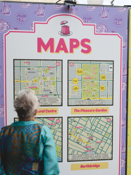
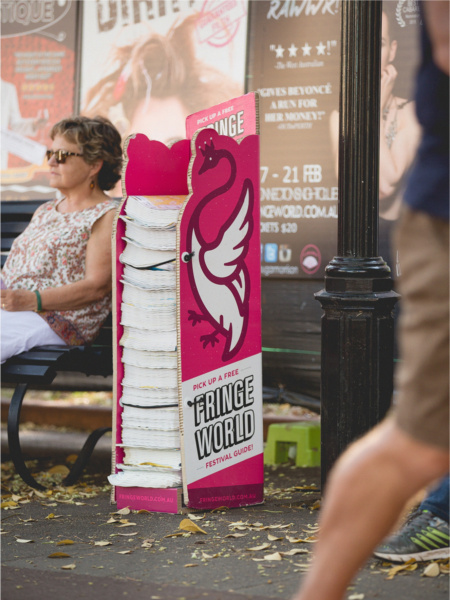
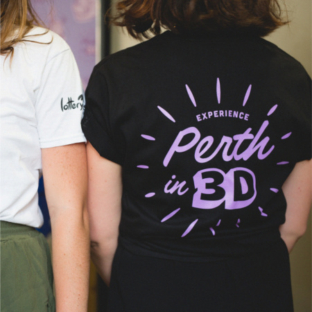
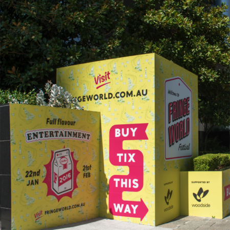
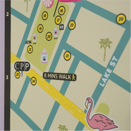
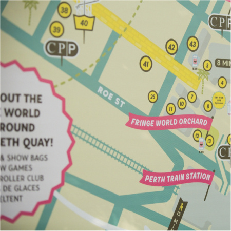
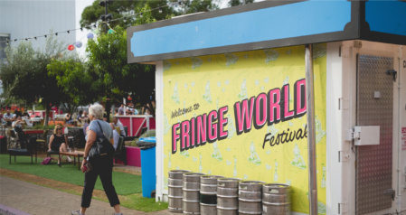
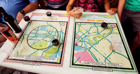
144 Print Publication, Festival Branding, Dump Bin Wrap, Letterhead, T-Shirts, Bus Wraps, Mural Designs, Wayfinding System, Pleasure Garden, Lightbox + Print Maps, Print Advertisement, Billboards, Bus Wraps, Tea Towels, Lanyard Passes, Magazine Stand, and Tablecloths.
View more Fringe World Festival case studies:
FW 2014 Case Study
FW 2015 Case Study
FW 2016 Case Study
FW 2017 Case Study
FW 2018 Case Study
FW 2019 Case Study
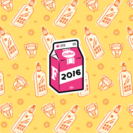
THE SOLUTION
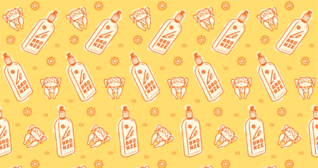
With the overwhelming success of Fringe World 2015 still lingering in the wind, and the good folk at Artrage’s wish to keep the brand humming, we took inspiration for the 2015 concept from the most ubiquitous of Australian symbols: the local Aussie milkbar. Fusing elements of milkbar signage, coffee chill cartons (an egalitarian symbol designed to rally the people of Perth), we aimed to create an identity that not only spoke to Fringe’s objectives, but to a nostalgia for the days of the Master’s Choc Regatta.